
The goal of anything published online is to be found. We are all aware of the importance of optimising copy for Google, but often the value of a word on a webpage is underestimated. If you were to strip a website of its copy, would its users still be able to achieve their goals? The readability of copy can sometimes be overlooked and no amount of witty words will make a user continue reading if you don’t offer them consistent, user-centric copy.
Most online users scan content, trying to pull the relevant information from a webpage as quickly as possible. In fact, on average users only read about 20% of the copy on a webpage and only 10-20% of users actually make it to the bottom of the post!
So, how do you keep users engaged? I’ve put together a few key tips to help improve the readability of your copy to ensure your users get the most out of your content.
Design, Develop and Write Inclusively
To reduce the time and effort required to take in your copy, the first step is to make it accessible to all of your users. By taking an inclusive approach early in the design process, you extend the reach of your content to those using assistive technologies, like screen readers or screen magnification software and create a foundation for usable, readable copy that benefits all users.
Example – Letter Casing
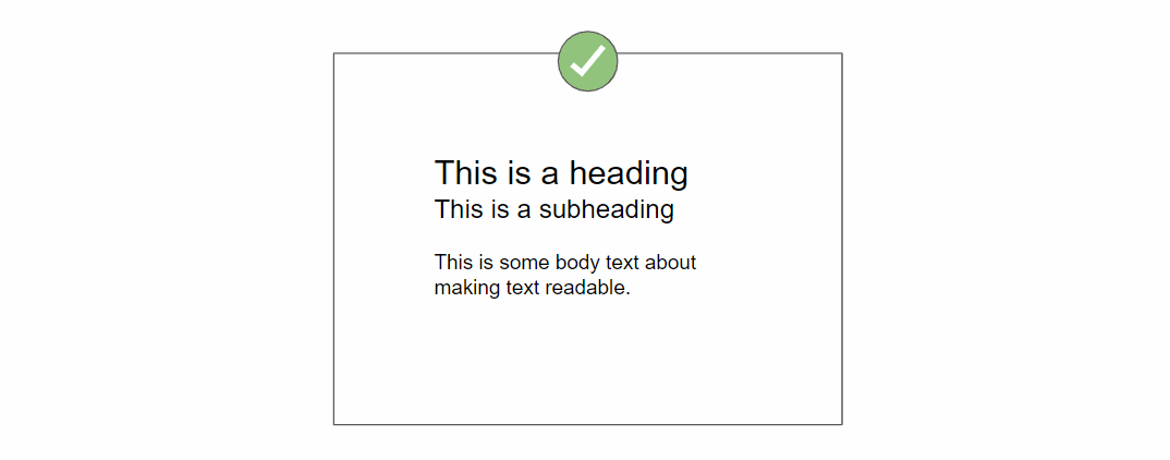
Letter casing is an important aspect to consider during website design. Using letter casing in the wrong way can reduce the readability for users. Many websites use capitalisation to emphasise a key message however, this can actually have the opposite effect. All capital letter copy is difficult to read as it reduces the contrast of each word. It becomes harder to recognise the shape of the word when we scan the copy. When copy is presented in title and sentence case, the eye is able to recognise the shape of the words and interpret the information quicker.
In a social context, typically all caps means you’re shouting. For users accessing a website using assistive technologies, all caps may also be problematic. For example, a screen reader may read all caps copy incorrectly compared to sentence case copy, which will be read normally.
Tips for content
If you’re a content creator, you might want to consider:
- legibility across the board; avoid colour combinations with a low contrast ratio and decorative or cursive font styles where possible.
- writing for your users; use appropriate language for your audience, consider the context of use, their age and reading abilities.
- controlling the mobile experience; minimise and prioritise content on smaller screens, focus on key areas and actionable content.
Tips for code
If you’re a developer, you might want to consider:
- implementing alternative text to ensure important information conveyed solely in images is available to screen reader users.
- using semantic markup to structure content; use heading tags in correct rank order and avoid relying on CSS styles to visually identify section headings.
- defining the page language to allow assistive technologies to read the page correctly.
Create Actionable Content
When we talk about digital copy, you’re probably thinking about blog posts and long-form copy, but words are used in every aspect of web design. These smaller elements (microcopy) such as error messages, form fields and call-to-actions are all part of the user journey and in some cases, critical points of action. It’s important to consider both marketing and microcopy when writing web content; focus on the journey of the user and what elements of the interface will help the user achieve their goal, with minimal effort.
Example – Error Messages

A good error message will include information about what went wrong in user friendly language, enabling the user to recover from the error without assistance. Often, a website’s error message can be overlooked, however offering a user-friendly message will help to persuade a frustrated user from navigating away from a website.
Tips for content
If you’re a content creator, you might want to consider:
- developing a goal based content strategy; what do you want your users to achieve, how can the copy on your site aid this?
- smaller elements means less copy; call-to-actions should be short and persuasive, form labels should be brief and instructive.
- keeping it real; try to be clear and match real world expectations. Is the user really ‘Starting an adventure’ or are they purchasing new shoes?
Tips for code
If you’re a developer, you might want to consider:
- set text wrapping rules using CSS to control where your copy breaks.
- control overflowing text with truncation styles such as ellipsis or fade out.
- apply scalable font sizes, using CSS3’s ‘rem’ units with a base font size will improve the readability across devices with minimal work.
Testing and Validation
For content editors, having a defined proofing process and a custom set of tools and shortcuts is a must. There are hundreds of browser plugins and applications out there that can help keep track of spelling and language. For developers, following standards and utilising code reviews in the development cycle will help to keep code maintainable.
Beyond that, getting an independent party or representative users to test your site can help to highlight some of the more subjective and contextual usability issues.
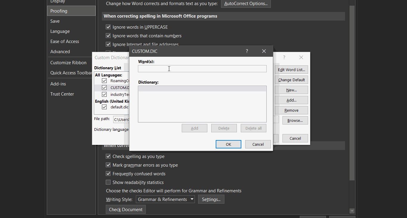
Example – Custom Dictionary
Tips for content
If you’re a content creator, you might want to consider:
- customise your spell-check, if you use specific names, industry terms or other words that might not belong in the dictionary, consider adding these to your personal dictionary or spell-check tool.
- verify the reading age of your content using the Flesch-Kincaid Reading Ease scale or a similar grading system.
- proof-readers and peer reviews; don’t rely solely on tools to check your content, the best way to find errors and areas for improvement is by getting someone else to read your work.
Tips for code
If you’re a developer, you might want to consider:
- viewing your site without CSS; does the document flow reflect the reading order?
- validating your markup; use a validation tool like W3C’s Markup Validation Service as a quick and easy way to flag problem areas in HTML and CSS.
- conducting cross-compatibility testing; view your written web content on a mixture of environments. Does your copy read as well on mobile as it does on web?
Summary
So, if you’re among the 10-20% of users that have actually reached the bottom of this article, we hope you’ve found it helpful, enjoyable and easy to read! In summary, considering microcopy and user journeys when conceptualising and developing will improve the online reading experience for all users. This in turn helps to improve the overall usability of your site which can lead to increased conversions and improved user satisfaction.
If you would like to find out more about usability testing, check out our Usability Service page or get in touch with one of our Client Partners or Technical Analysts by heading over to our Contact page
A quick note from our Marketing Manager, Cass, who manages our website…
“I know! Before you say it! Our website needs to follow some of the tips from Yasmin and that’s why we are currently working towards a few design changes that will increase the usability and our overall user experience.”
Related blog posts:
5 ways testing can improve your digital customer experience
Accessibility Focus: How to improve your content’s readability
Share this post
Published by Yasmin Howell
on the 23rd July 2019
Usability Lead at Zoonou